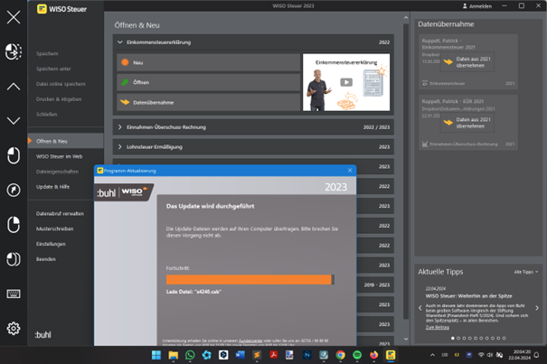
I can really visualise how it must have gone at buhl:data. Everyone is sitting bored at the stylish oval conference table. Nobody has a brilliant idea of how to make tax software more attractive for customers. It's the same crap every year and let's face it, nobody wants to do their own tax return. Not even with the wiso software.
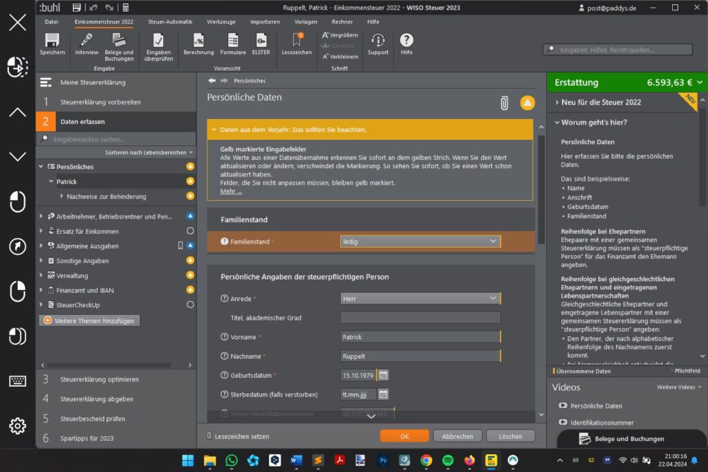
Steve enters the room. Steve has the solution. We're changing the colours of the software, says Steve. Instead of a high-contrast user interface or a dark mode, which is actually standard today, we're now making everything grey. Light grey text on a medium grey background. And dark grey areas around the outside. Also with grey lettering.
Everyone thought Steve's idea was cool.
None of the people present tried it out. Because, let's face it, nobody wants to do their own tax return. Not even with the wiso software.

No kidding, I don't recognise anything.
But Steve has the solutions for me too. Hights in yellow text on a yellow background. If that's not a real highlight.
